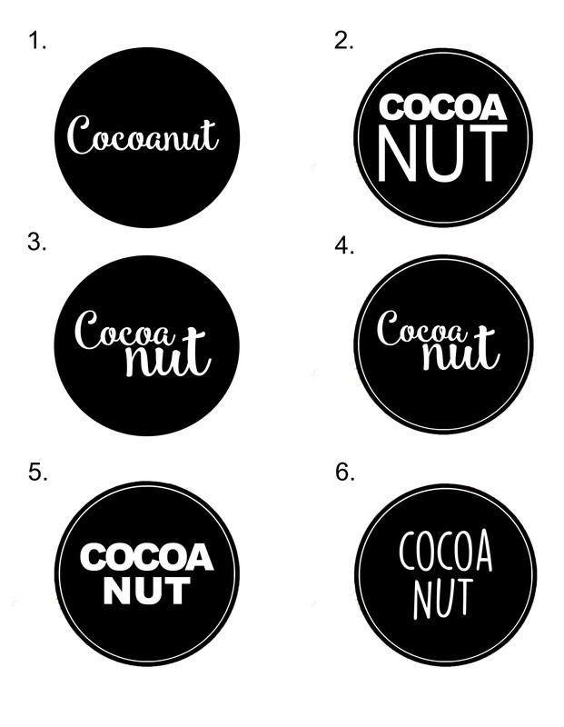
Here are six variations of a similar logo design. I want me brand to be associated with colour and being fun, exciting and unique. I want the logo to stand out against my designs on the packaging, that is why I have chose a black and white colour scheme for them. I've used three different fonts within these designs so that I can compare thier effectiveness.
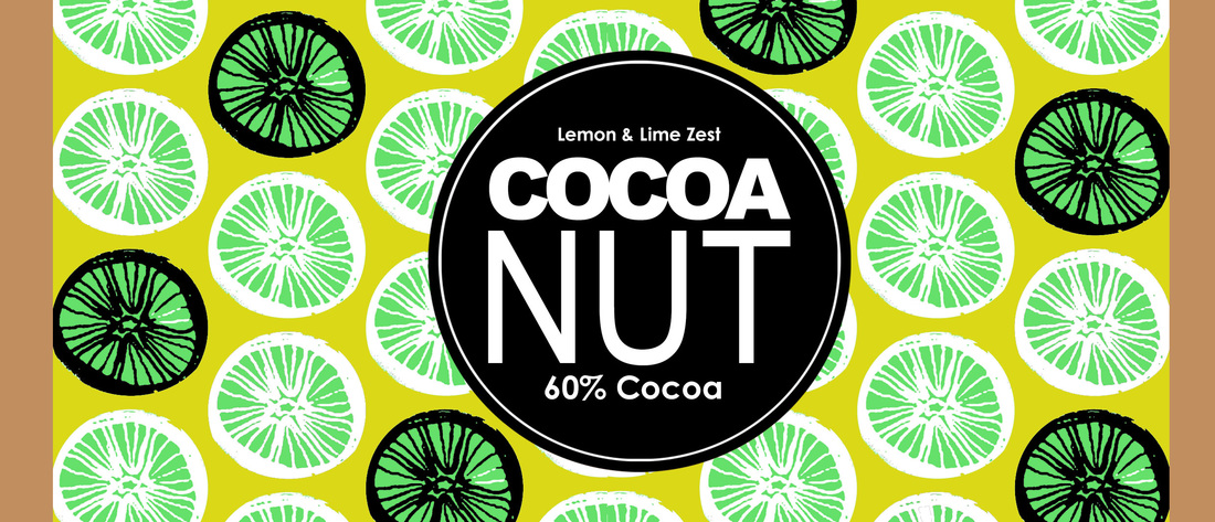
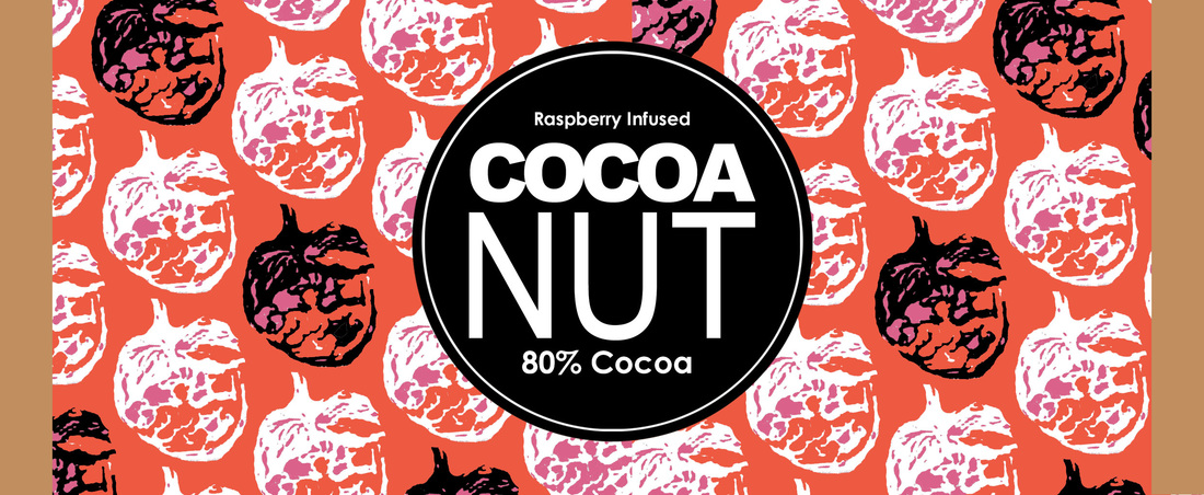
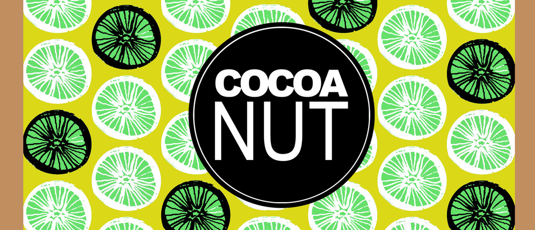
I also decided on a round logo rather than a square/rectangle one as I think it looks more effective and will look better placed on the designs, without looking out of place.
I also decided on a round logo rather than a square/rectangle one as I think it looks more effective and will look better placed on the designs, without looking out of place.


 RSS Feed
