  |  |
|
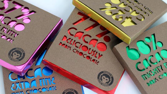
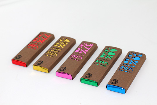
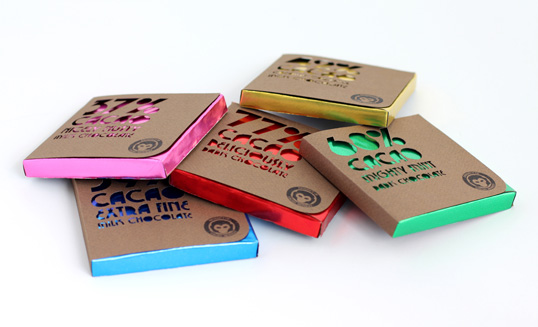
“The project was self-directed and the students were invited to write their own brief on whatever interested them the most. I chose to create an identity and packaging design for a fictional chocolate company called ‘Cacao Monkey’. The text on the front of the packaging was die-cut by hand into rough brown paper, chosen to suggest the organic chocolate. This reveals the bright aluminum foil beneath, which distinguishes each flavour of chocolate. The minimal design reflects the simple, honest ethics of the brand: organic, fairtrade and eco-friendly.” This is really interesting as someone before me has chosen to do the same subject for their brief. It's interesting for me to see what her final outcome was and why she chose to create it in the way she did. I really love the simplicity of these designs. The designer of these said that the brown recycled paper she has used is representational of the organic chocolate. I think this is a really cleaver idea as the letters she has cut out show the brightly coloured foil through the gaps, which makes the packaging eye catching and unique. I would like to have a go at doing something similar, even using the same coloured card as I think it looks really smart. I also really like the company logo and the placement of it on the packaging.  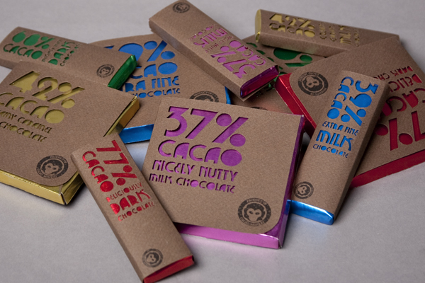 I now need to research into where chocolate is made and produced, this will help me with the specifics of my product and deciding a company name and unique selling point.
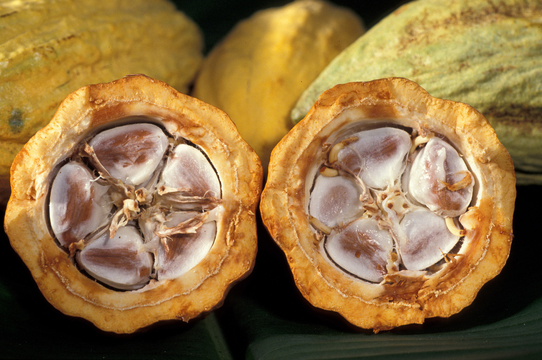
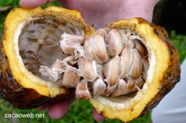
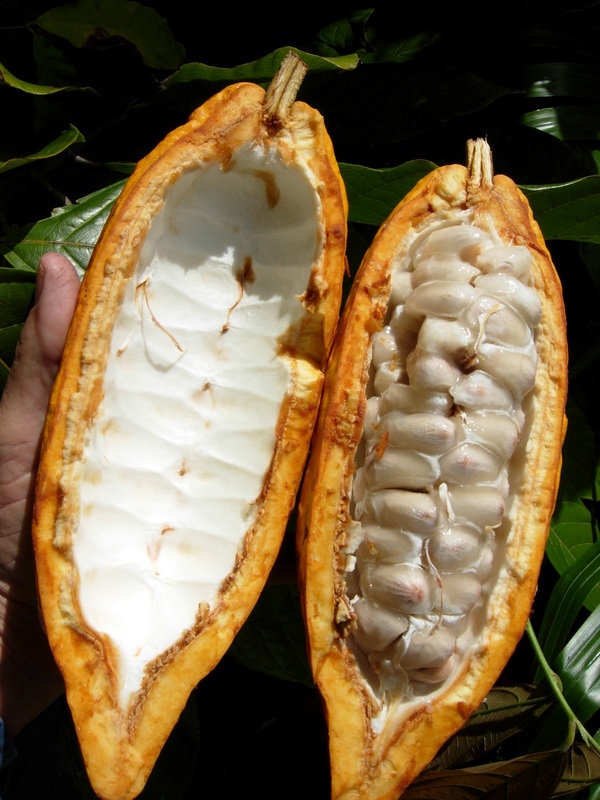
Cadbury's say: "Cocoa Growing Countries The cocoa tree is a native of the Amazon basin and other tropical areas of South and Central America, where wild varieties still grow in the forests, but the cocoa growing area has extended to the Carribbean and beyond. Different types of cocoa are selected for cultivation in the various growing areas. In Australia, Cadbury uses high quality cocoa beans sourced from Ghana in West Africa and Asia. Most of the world's cocoa is grown in a narrow belt 10 degrees either side of the Equator because cocoa trees grow well in humid tropical climates with regular rains and a short dry season. The trees need even temperatures between 21-23 degrees Celsius, with a fairly constant rainfall of 1000-2500mm per year. Many countries now grow cocoa. The main producers outside the main central American producers, Brazil and Ecuador, are: West Africa Ghana, which grows some of the best quality cocoa in the world, Nigeria and Cote D'Ivore. Cocoa was first planted in Ghana, now a major producer, in 1879 and as in the rest of West Africa, cocoa is grown almost entirely on small family farms. Cocoa farming is a small unsophisticated business as the current planting patterns of cocoa trees make mechanisation impractical. Asia In Asia, public and private plantations have been developed as well as small farms. Malaysia and Indonesia, where the cocoa is a relatively new crop, are becoming increasingly important growing areas." http://www.wisegeek.com/how-is-chocolate-made.htm I found a good explanation into how chocolate is made on this website. I found this part particularly interesting... "Chocolate is a general term used to describe a number of foods made from the cacao bean. It is particularly used to describe a sweet confection made from cacao with sugar added. There are many different ways to prepare it, some dating back thousands of years. It is believed that chocolate use by the Mayans dates back more than 2,500 years, and the Aztecs are also known to have used it ritually and for pleasure. This chocolate was consumed as a bitter drink, sometimes with hot peppers added, and was an important item throughout the New World." 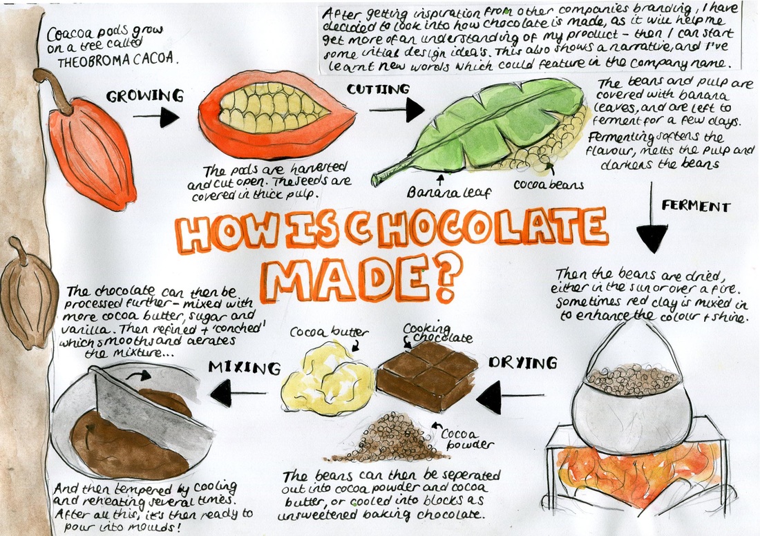 I created this diagram in my sketchbook to simplify how chocolate is made. There are a lot of elements I could take from this when deicded on what type of chocolate I am going to be designing for. I now need to see what countries chocolate is grown in and where is it mainly produced, where the best chocolate is from etc. I can then decide the specifics and start my design work.
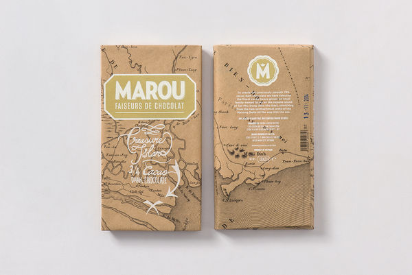
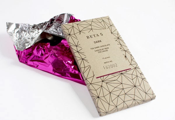
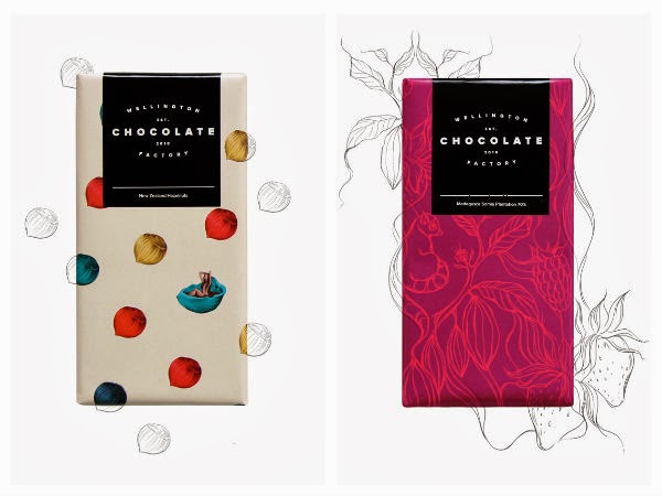
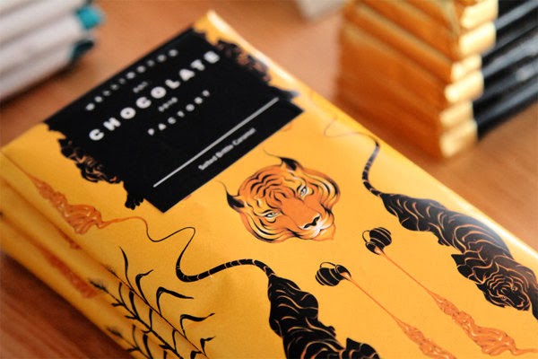
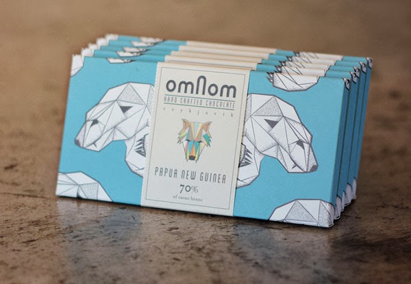
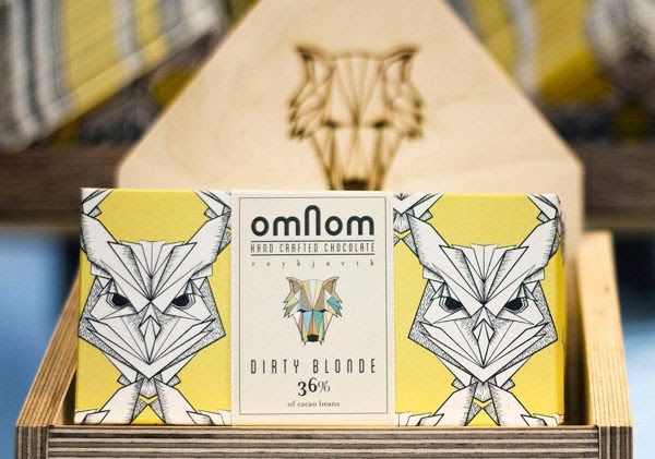
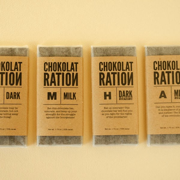
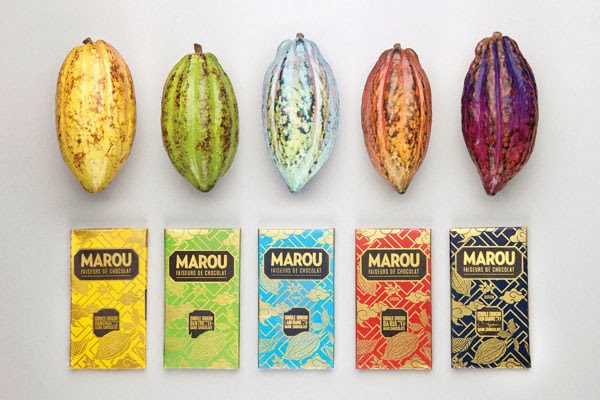
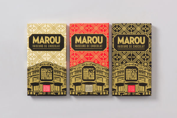
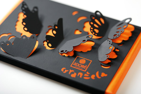
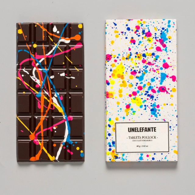
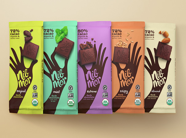
Abracadabra ChocolateI found this company on Google while searching for inspirational packaging idea's. I really love the fun and simplicity of these designs, and how the expressions and colours represent each different feature of the chocolate. 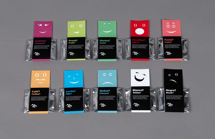 The designer for this brand, Pedro Miguel Lopes says: "Abracadabra is a brand that produces exclusive chocolate, Its concept is based on the surprise effect on the magic and the chill moments of life. I designed an identity of this brand that put the chocolates as a protagonist of a visual system that suggests sensacionally surprises and magic tastes. The identity is totally represented by Logotype, Packaging, Bags, Chocolate Packs, Catalogue, Interior Design of a store and Staff Uniforms." 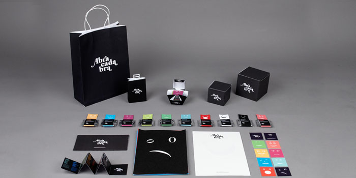 This is ultimately what I would like to present as my final piece. He has designed the company logo, gift bags, chocolate packets and boxes and a leaflet, as well as more. omNom Chocolate From Iceland Here's another company I found online and a style that I really like. I love the different uses of colours and illustrations which match the different types of chocolate and flavours in the packet. I aldo like the packaging in the top left (the wolf face in the brown cardboard box). Just from looking at these designs I can tell that they are aimed at young people because of the fun and fresh designs. I really like the company logo too, but I can't find much information about that it represents. 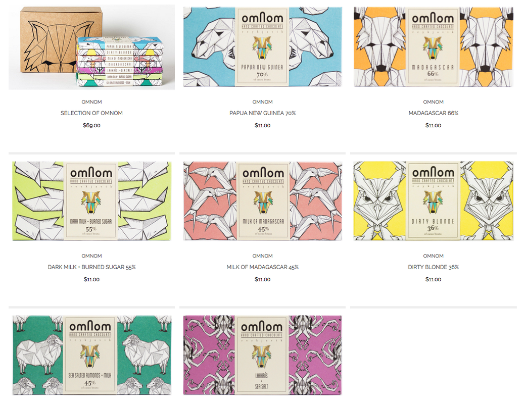 More packaging that I find inspiring!I've found loads of inspiring and interesting branding/packaging example online, here are a few of my favorites... After finding inspiration online, I've realized that I am most drawn to colorful and exciting packaging like the example's above. I now need to decide what type of chocolate company I am going to be designing for, and decide all the details about it so I can come up with a well suited packaging and branding idea.
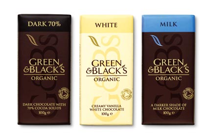
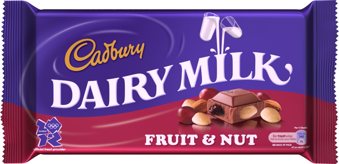
I've decided the best place for me to start is by getting some inspiration from existing chocolate brands and the way that they have used packaging to draw in their target audience. I'm hoping that I can get a feel for what type of chocolate I am going to be branding and what audience I want to aim at. A good example is a bar of Cadbury's milk chocolate vs. Green & Blacks Organic chocolate. Cadbury's is about half the price, and this reflects in the companies use of design and packaging...
Both companies are selling the same thing - chocolate. But both have used very different branding and packaging strategies. Green & Blacks is organic, which means it is generally aimed at a "higher class", and is considered a more luxurious chocolate. This reflects in their packaging as it's very smart with little use of loud colours.
Cadbury's on the other hand is not organic and therefore is a lower price. They have a much more "fun" and interesting looking packet, which would be more appealing to children due to the use of colours and imagery. Having said that, in colour psychology purple is actually associated with luxury. |
AuthorWrite something about yourself. No need to be fancy, just an overview. ArchivesCategories |
 RSS Feed
