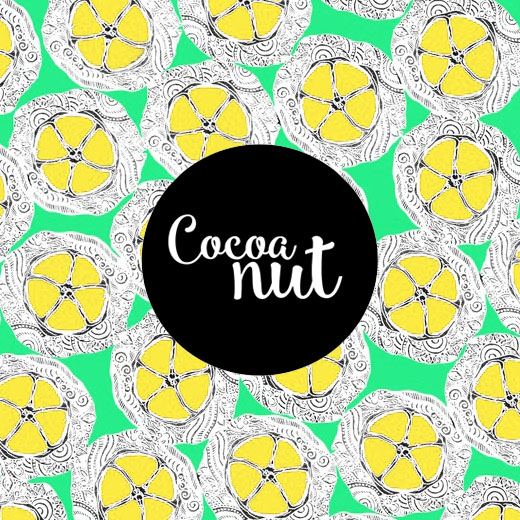
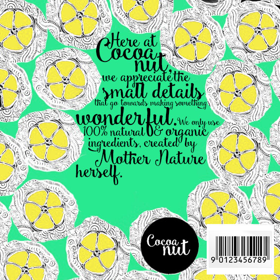
  | 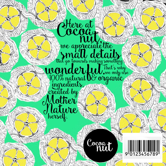 Here are the designs I came up with for the back of the chocolate boxes. I wanted to keep it simple and flowing, so I chose to use the same font as the logo, and this helps with brand recognision and adds to the fun, quirky feel. I used an eraser on Photoshop to create a space in the middle of the repeat pattern, this then allowed me to put text into the space. I chose to write this as it very briefly outlines what the company believes in and that they are natural and organic. I think it works well because it looks visually appealing, yet it is informative at the same time. |
 RSS Feed
