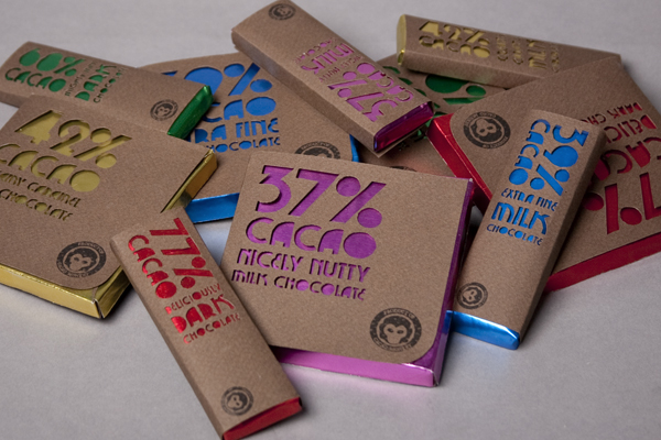
“The project was self-directed and the students were invited to write their own brief on whatever interested them the most. I chose to create an identity and packaging design for a fictional chocolate company called ‘Cacao Monkey’. The text on the front of the packaging was die-cut by hand into rough brown paper, chosen to suggest the organic chocolate. This reveals the bright aluminum foil beneath, which distinguishes each flavour of chocolate. The minimal design reflects the simple, honest ethics of the brand: organic, fairtrade and eco-friendly.”
This is really interesting as someone before me has chosen to do the same subject for their brief. It's interesting for me to see what her final outcome was and why she chose to create it in the way she did.
This is really interesting as someone before me has chosen to do the same subject for their brief. It's interesting for me to see what her final outcome was and why she chose to create it in the way she did.
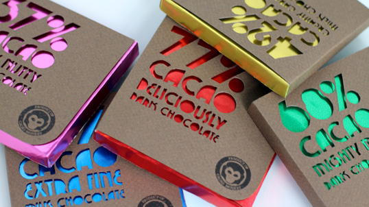
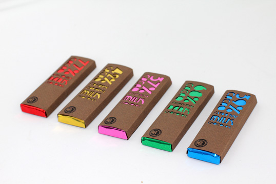
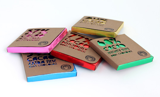
I really love the simplicity of these designs. The designer of these said that the brown recycled paper she has used is representational of the organic chocolate. I think this is a really cleaver idea as the letters she has cut out show the brightly coloured foil through the gaps, which makes the packaging eye catching and unique.
I would like to have a go at doing something similar, even using the same coloured card as I think it looks really smart. I also really like the company logo and the placement of it on the packaging.
I would like to have a go at doing something similar, even using the same coloured card as I think it looks really smart. I also really like the company logo and the placement of it on the packaging.
 RSS Feed
