I've decided the best place for me to start is by getting some inspiration from existing chocolate brands and the way that they have used packaging to draw in their target audience. I'm hoping that I can get a feel for what type of chocolate I am going to be branding and what audience I want to aim at.
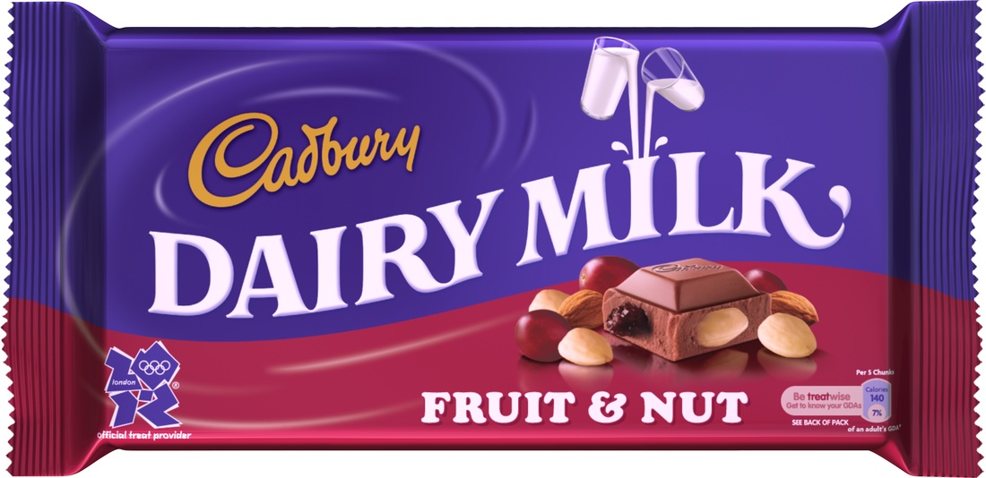
A good example is a bar of Cadbury's milk chocolate vs. Green & Blacks Organic chocolate. Cadbury's is about half the price, and this reflects in the companies use of design and packaging...
A good example is a bar of Cadbury's milk chocolate vs. Green & Blacks Organic chocolate. Cadbury's is about half the price, and this reflects in the companies use of design and packaging...
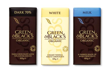 |  |
Both companies are selling the same thing - chocolate. But both have used very different branding and packaging strategies. Green & Blacks is organic, which means it is generally aimed at a "higher class", and is considered a more luxurious chocolate. This reflects in their packaging as it's very smart with little use of loud colours.
Cadbury's on the other hand is not organic and therefore is a lower price. They have a much more "fun" and interesting looking packet, which would be more appealing to children due to the use of colours and imagery. Having said that, in colour psychology purple is actually associated with luxury.
Cadbury's on the other hand is not organic and therefore is a lower price. They have a much more "fun" and interesting looking packet, which would be more appealing to children due to the use of colours and imagery. Having said that, in colour psychology purple is actually associated with luxury.
 RSS Feed
